I’m recently taking this exiting course on web accessibility at edX: W3C – Introduction to Web Accessibility, as recommended by a participant of the code pub event last june. Module 2 introduced users of assistive technology and how easy it is to make digital products more accessible by enabling customization for the user.
Implementing full customization is the next step, but I think every user values an application, that he can bend to her needs.
The problem
As I introduced recently, colors lacking contrast are one of the most problematic barriers in digital products. Even when implementing the highes contrast of 1:7, there might be color combinations, that suit certain users even better. Additionally, I am ok if people don’t like the color scheme I choose for the app.
As part of my user settings, I want to enable my users to choose background, text and highlight-colors, as well as text-size and line spacing. In the future I would love to expand this list with different fonts and some more options.
I first need a preview of the chosen settings, followed by a button to apply the changes to the whole app. And save the variables.
The solution
I knew soon that I had to use css variables. They can be used in the styles to unify colors, sizes and paddings. And therefore be easily changes. The bonus of css-vars is, that they can be changed dynamically – and that’s exactly what I need.
A great resource has been the article Theming Angular with CSS variables (by Austin).
The changed customization must be saved and restored on a later visit, but I wont go into that in this post. Additionally, I want a preview to see the result my customization would make.
The actual coding
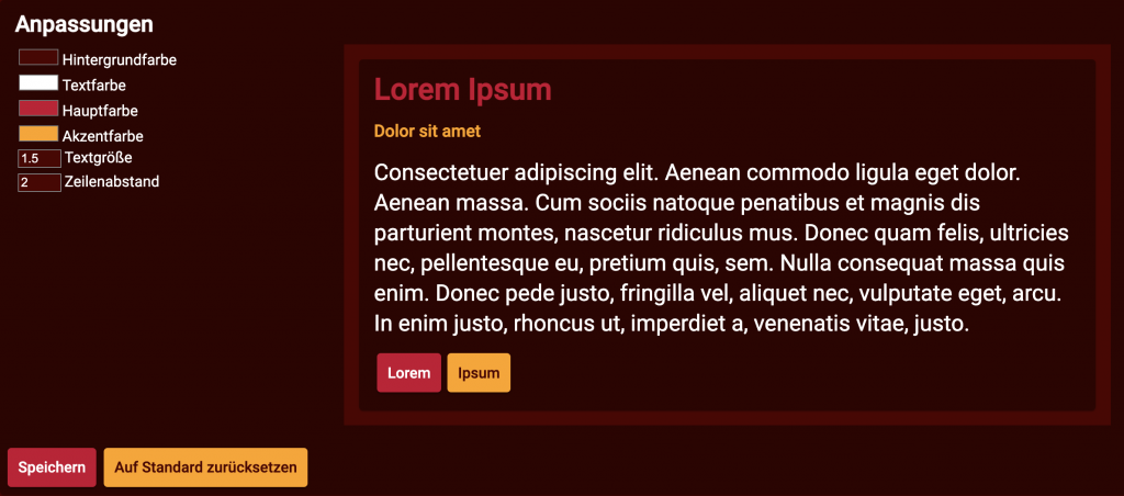
Within my settings page, there is now a customization component. On the right is a preview for the changes that are applied when clicking “save”.

The preview works by directly using the styles from the input elements. There is a bit of a delay but I think thats fine to work with. Here is an example for the different buttons:
       <div>
          <button
            mat-raised-button
            [style.color]="textColorInput.value"
            [style.background-color]="primaryColorInput.value"
          >Lorem</button>
          <button
            mat-raised-button
            [style.color]="backgroundColorInput.value"
            [style.background-color]="secondaryColorInput.value"
          >Ipsum</button>
        </div>
When hitting “save” on my customization component, the ThemeService is called with the selected colors and values. backgroundColor, textSize, and the others are set by the user.
this.themeService.updateTheme('wp', {
    '--background-color': backgroundColor,
    '--text-color': textColor,
    '--primary-color': primaryColor,
    '--accent-color': secondaryColor,
    '--text-size': textSize.toString(),
    '--line-spacing': lineSpacing.toString(),
});
The ThemeService then updates the apps theme accordingly.
updateTheme(name: string, properties: { [key: string]: string; }) {
    const theme = this.getTheme(name);
    theme.properties = {
      ...theme.properties,
      ...properties
    };

    if (name === this.theme) {
      this.themeChange.emit(theme);
    }
  }
This then works because the styles use the css-variables. So here is a snippet from my styles.scss.
body {
  margin: 0;
  font-family: Roboto, "Helvetica Neue", sans-serif;
  font-size: var(--text-size);
  line-height: var(--line-spacing);
}

.mat-app-background {
  background-color: var(--background-color);
}
In the main app.component.ts, there then is a subscription to update these variables whenever the theme is changed.
{...
this.themeService.themeChange
      .subscribe((theme: Theme) => this.updateTheme(theme));
...}
...
private updateTheme(theme: Theme) {
    const element = document.documentElement;

    // project properties onto the element
    for (const key in theme.properties) {
      element.style.setProperty(key, theme.properties[key])
    }
}
The result
My angular app is still on its way to a stable beta version, but in the meantime it is my perfect guinea pig for this kind of features.
I absolutely love the customization feature (for myself) and I hope that it will bring value to my future users and to those, I have inspired.

Leave a Reply